

This wonderful Cornish workshop and museum is dedicated to the legacy of studio pottery trailblazer Bernard Leach
Become an instant expert on colour theory in early modern art
Become an instant expert on colour theory in early modern art
How did artists such as Signac, Seurat and Monet harness colour so powerfully? By studying expert theories on its use, says Caroline Levisse. Here are the things to know about those theories, from how colours ‘behave’ to the ‘friendship’ of certain hues
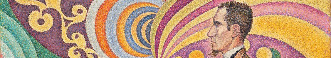
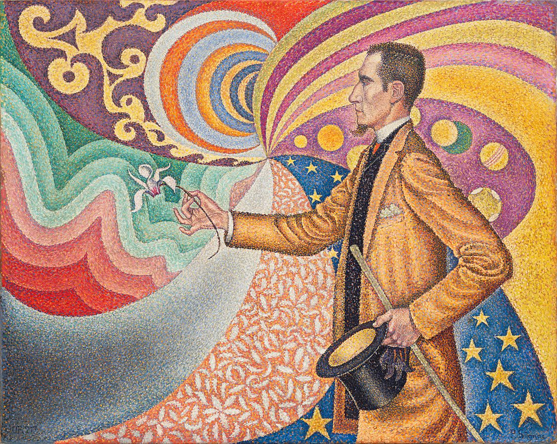 Colour magic: Paul Signac’s Opus 217. Against the Enamel of a Background Rhythmic with Beats and Angles, Tones, and Tints, Portrait of M. Félix Fénéon in 1890; Fénéon was an art critic and a champion of the Neo-Impressionists
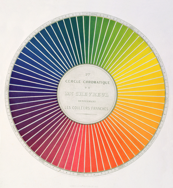 A wheel of colour: this one is from Michel Eugène Chevreul’s book Expose d’un Moyen de definer et e bomber les couleurs, 1861
1. A WHEEL OF COLOUR
Through time, painters and theoreticians of art have written about colour symbolism, and colour as paints (ie pigments, medium and techniques), but they’ve had relatively little to say about colour as a matter of visual perception.
In 1436, in his Della Pittura, the polymathic author, architect, artist and principal initiator of Renaissance art theory Leon Battista Alberti noted a ‘friendship of colours’. He observed, for example, that pink, blue and green made a particularly harmonious combination.
Following progress in the science of optics, and in line with the importance of understanding phenomena from a rational point of view, it was only in the 18th and 19th centuries that there was a real attempt at finding the laws ruling the phenomenon of colour perception. Such rules were based on scientific reasoning, and predicted how colours should behave.
The resulting ideas form what is known as ‘colour theory’.
To an extent, this theory is based on the findings of Isaac Newton who, in the 17th century, demonstrated the intrinsic relation between light and colour. As a beam of light passed through a prism and came out at slightly different angles, the different wavelengths of the visible light spectrum became discernible as a range of colours, from red to violet. Even though this range of colours is better presented as a horizontal band, Newton presented it as a wheel and placed seven colours on it.
The wheel is a practical device to present colours and order them. It became popular and to this day colour relationships are commonly presented in a wheel-shaped diagram. With the wheel, we can visualise the connection between primary colours (blue, yellow and red) and secondary ones (green, orange and purple), with each secondary colour resulting from a blend of two primary ones.
The wheel can also be divided into ‘warm’ (red, orange and yellow) and ‘cool’ (green, blue and purple). And with it, we can group some colours as analogous, such as yellow and orange, and others as pairs of opposites, named ‘complementary’, such as orange and blue.
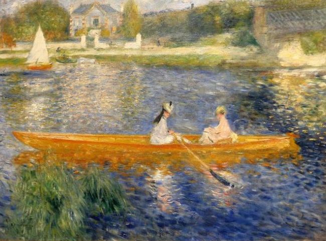 Pierre-Auguste Renoir’s The Skiff (La Yole)
2. COLOURFUL CONTRASTS
In the early 19th century Michel Eugène Chevreul, the head chemist at the historic tapestry workshop in Paris, La Manufacture des Gobelins, wanted to understand why people complained about their tapestries' lack of chromatic strength.
The dyeing process was not to blame; Chevreul realised the problem was actually one of perception.
The colours in question lacked brilliance and chroma because of the effect on them of the colour of neighbouring threads. Some colour juxtapositions made them appear more muted than they were.
Intrigued, Chevreul continued to study how colours influence one another. In particular, he noted that when stimulated with one colour – yellow, for instance – our eyes will see what he called an ‘afterimage’ of the opposite colour – in this case, blue-mauve. He called these pairs of opposite colours ‘complementary’.
Chevreul showed that when complementary colours are juxtaposed, our brain enhances their contrast. In other words, if red and green are next to one another, the red will seem redder and the green greener. Chevreul described these effects in his 1839 book On the Law of Simultaneous Contrast of Colours: And Its Timeless Applications in All the Visual Arts.
Delacroix was among the first painters to be interested in Chevreul’s theories. In the artist’s paintings pairs of complementary colours, such as red and green, can be found.
Throughout the 19th century, Chevreul’s ideas were also popularised in books geared towards artists and designers, including the work by the American physicist Ogden Rood, Modern Chromatics, with applications to art and industry, published in 1879.
Artists such as Monet were also focused on colour. In an 1888 interview he remarked: ‘Colour owes its brightness to force of contrast rather than to its inherent qualities […] primary colours look brightest when they are brought into contrast with their complementaries.’
He painted many works in which he used pairs of complementary colours to intensify the chromatic effect and the vibrance of his work; see, for instance, his green fields with red poppies. And in Renoir’s The Skiff (1875, seen here), the pure cobalt blue and bright orange are so strong together that they completely eclipse the more muted background of the scene.
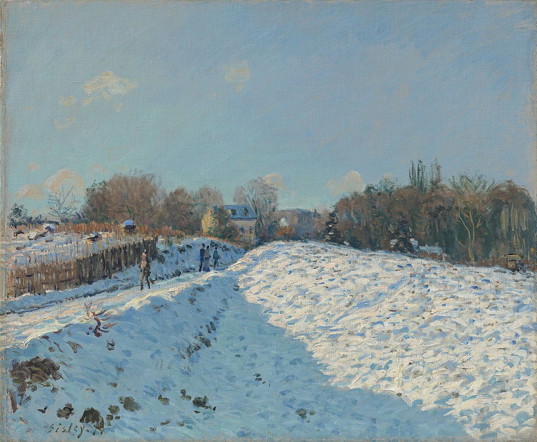 Alfred Sisley’s Snow Effect in Louveciennes
3. BLUE SHADOWS
The Impressionists are famous for their ability to render effects of light with paints. For them, it all started with the close observation of the colours around them in nature. They were fascinated with how light could change the apparent colours of objects. Think about Monet’s Haystacks or his Rouen Cathedral, two series of paintings in which the object did not change, just the light in which it was perceived.
Like Goethe before them – or Gustave Courbet – the Impressionists noted that shadows are not simply grey. In his 1810 Theory of Colours, Goethe remembered noticing: ‘The sun […] sinking towards the Oder ponds. During the day, owing to the yellowish hue of the snow, shadows tending to violet had already been observable: these might now be pronounced to be decidedly blue, as the illuminated parts exhibited a yellow deepening to orange.’
Depending on the colour of the sunlight (orange, yellow, pink or red), the shadows could take on a blue, purple or green tint. This was easily observable on women’s white dresses, on snow, or on the white façade of Parisian buildings. In the paintings of Monet, Pissarro and Sisley, these are rarely just white or grey, but painted in a variety of hues.
In 1874 Sisley painted a fantastic winter landscape, Snow Effect in Louveciennes, seen above.
He placed a large triangular shadow in the foreground, contrasting with the sunlit snow. As the blue sky tells us, this was a beautiful, sunny day. And rather than paint the shadow in a shade of grey, he used a beautiful blue. This chromatic effect heightens the luminosity of the painting in a spectacular way. It is vibrant. For some critics these unconventional chromatic effects were simply too excessive, and soon the painters were accused of ‘indigomania’.
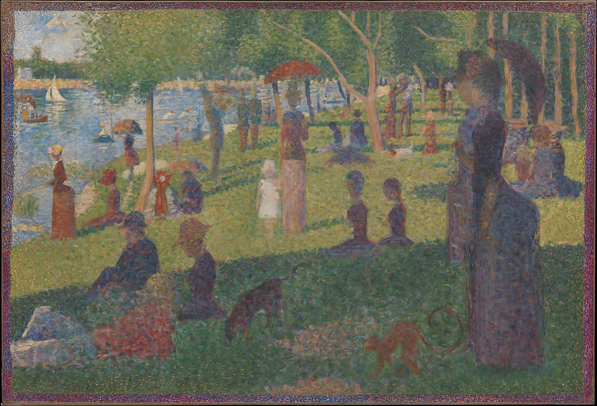 George Seurat’s study for A Sunday Afternoon on the Island of la Grande Jatte
4. COLOURED DOTS
For Georges Seurat, colour theory was a source of inspiration.
As Pissarro explained to the art dealer Durand-Ruel in an 1886 letter: ‘Mr Seurat […] was the first to have the idea of applying scientific theory, after having studied it fully.’
The method he pioneered was sometimes referred to as ‘scientific impressionism’, because in the making of a painting, the artist was guided by his understanding of the science of colour perception and optics.
In 1886, Seurat shocked the audience with his A Sunday Afternoon on the Island of la Grande Jatte, a study for which you see above. He was now using little dots of paint, juxtaposed to one another, to create his pictures.
If today we refer to this style as ‘pointillism’, Seurat preferred ‘divisionism’.
When studying a scene, a person, an object or a detail, Seurat would analyse and divide the perceived colour into its different components: one – the local colour of the object; two – the colour of the light; three – the colour of the shadows, dependent on the colour of the light; four – the reflected colours from surrounding objects; five – the influence of complementary colours, and so on. For each component a colour was applied next to others in a series of discrete dots.
If seen at the correct distance, the dots would blend in the beholder’s eyes and brain, and result in a perceived colour. The Neo-Impressionist painter could thus avoid the darkening of colours created by the mixture of paints on the palette or canvas. Using this ‘optical mixture’ instead, they retained the brilliance of individual colours. Seurat and his colleagues Signac, Pissarro and Luce, among others, hoped to create paintings that were more luminous than ever before.
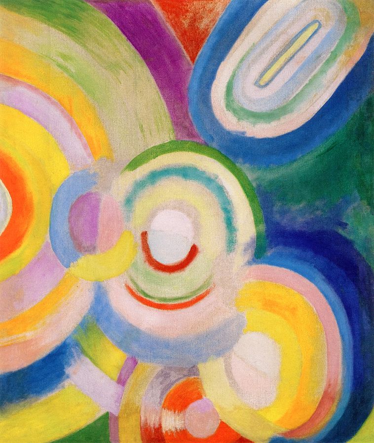 Robert Delaunay’s Colored Discs, 1913
5. DANCING COLOURS
In the 20th century many artists turned to colour theory as a source of inspiration: Johannes Itten and Josef Albers at the Bauhaus, and Matisse, Robert and Sonia Delaunay, Kupka, Kandinsky, Klee, Stanton Macdonald-Wright and more. They did so freely, rarely in a dogmatic way.
Looking to create works of art that would be as energetic and dynamic as his epoch was, Robert Delaunay focused on colours as vibrations. He thought of them moving at different speeds and imagined that the juxtaposition of specific colours would create the illusion of movement. For example, he speculated that, when placed together, yellow and orange would both vibrate faster. But if orange was juxtaposed to blue, they would pulse at a slower pace.
His ideas about colour did not come solely from colour theory, but also from his observation of the world. Sonia Delaunay recounted how her husband used to stare at the sun and then close his eyes to study the colourful patterns appearing on his retina. His series Circular Forms, Sun (1913) evokes such experiences.
One should not, of course, stare directly at the sun. Try instead staring at a street light at night, on a rainy day, and it may reveal colourful rings radiating from the source of light and, later, rings of contrasting colours may linger on the retina.
There are concentric rings in Sonia and Robert Delaunay’s paintings. As you stare at the centre of one of these rings in First Disc (1912) or Pigs Manege (1922), some of the parts appear to start moving. Some are coming forward, others rotating clockwise or anticlockwise.
Nowadays we are more familiar with such illusions, as a group of artists explored this field towards the end of the 20th century. Among them is Bridget Riley, who has studied colour interactions and linear patterns to create optical illusions. She has created a multitude of paintings in front of which we see colours move, pulse, undulate, transform, radiate and vibrate.
CAROLINE'S TOP TIPS
When describing a colour:
- Look at its hue (whether it is close to red, yellow, blue…)
- Look at its value (whether it is light or dark)
- Look at its chroma, or saturation (whether it is dull or brightly coloured, ie saturated)
These are three dimensions that allow us to ‘measure’ a colour.
Bear in mind…
…that colour theory is not an exact science. It is important, as it helps us think about colours and the way we perceive them, but it does not have simple and definite answers. As Claude Monet and Paul Klee both cautioned, in the end, they would rather rely on their intuition, experience and observation than on theories.
To discover more…
I recommend reading Josef Albers’ brilliant Interaction of Colors (1963) and recreating at home some of the experiments he describes. Johannes Itten’s The Elements of Colour (1961) is another fascinating read. And if you are looking for a more general, historical overview, John Gage’s Colour in Art (2006) is a good place to start.
About the Author
MORE FEATURES

Ever wanted to write a crime novel? As Britain’s annual crime writing festival opens, we uncover some top leads

It’s just 10 days until the Summer Olympic Games open in Paris. To mark the moment, Simon Inglis reveals how art and design play a key part in this, the world’s most spectacular multi-sport competition