This wonderful Cornish workshop and museum is dedicated to the legacy of studio pottery trailblazer Bernard Leach
Become an Instant Expert on Andy Warhol
Become an Instant Expert on Andy Warhol
20 Mar 2020
Andy Warhol was a pioneer of Pop Art. Our expert, Arts Society Lecturer Dr Suzanne Fagence Cooper, reveals five facts about the artist and his approach to the art movement that spun on celebrity, everyday objects and popular culture.
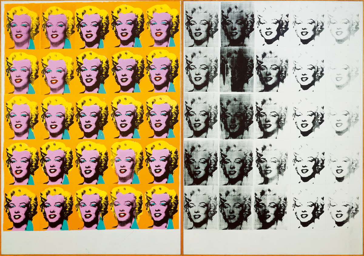 Marilyn Diptych 1962, Tate © 2019 The Andy Warhol Foundation for the Visual Arts, Inc / Artists Right Society (ARS), New York and DACS, London
1. Warhol was the most famous face of the American Pop Art movement...
…but the origins of Pop Art are found in London, with the This is Tomorrow exhibition held at the Whitechapel Gallery in 1956. The artist Richard Hamilton, who designed the exhibition poster, described the movement as: ‘Popular, Transient, Expendable, Low cost, Mass produced, Young, Witty, Sexy, Gimmicky, Glamorous, Big business.’ Warhol’s art embodied all these. He was fascinated by ephemeral design, like comics, packaging, postcards and Polaroid photos. From 1974 until his death in 1987 he created Time Capsules – over 600 cardboard boxes and drawers filled with the type of things we usually throw away.
The contents of these boxes – souvenirs of his magpie hoarding, from fan letters, telephone messages and pornographic collages to toenail clippings – are now conserved at The Warhol (The Andy Warhol Museum) in his home town of Pittsburgh. The last box was opened in 2014. A Warhol devotee paid $30,000 to unseal the tape and reveal the random keepsakes. They would have been worthless if Warhol or his assistant had not stashed them away. As Warhol told a friend: ‘I can simply be an artist without doing any art: I am the art.’
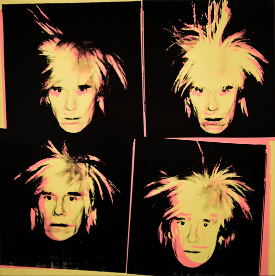 Andy Warhol, self portrait, 1986 silkscreen ink on canvas, © Alamy
2. He loved sparkles, heels and repetition
Shoes were one of the most consistent motifs in Warhol’s work and the roots of this were formed in his early career. Born in Pittsburg in 1928, the youngest son of Czech immigrants from the Carpathian Mountains, he moved to New York in 1949 to work as an illustrator. His training as a graphic designer underpinned his later career. In those early days he specialised in drawing shoes, adding personality, glamour and a touch of humour to each illustration. Women’s Wear Daily called him ‘The Leonardo da Vinci of the shoe trade’. Warhol’s love of shoes persisted into the 1980s, with his Diamond Dust Shoes series – pictures of high heels scattered on the floor, based on close-up Polaroid snaps. The surface of these works sparkled softly, like late nights in a disco.
Warhol also loved repetition. In the early 1960s he began designing dress fabrics in vibrant, non-naturalistic shades. He made repeating patterns of hand-drawn buttons, insects, watermelons and ice-cream sundaes with a cherry on top of each. The technique of repetition, and of printing different colourways over a black outline, fed into his later studio practice. We see the same process in his silkscreen prints of celebrities, with their green skin or blue lips. Warhol was clear about his methods and intent, explaining: ‘I started as a commercial artist. I was always a commercial artist.’
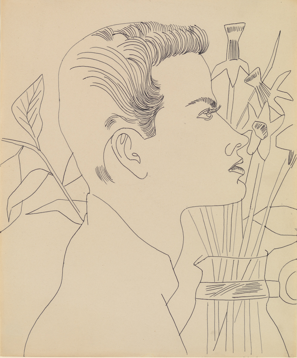 Boy with Flowers 1955-7. ARTIST ROOMS Tate and National Galleries of Scotland. © 2019 The Andy Warhol Foundation for the Visual Arts, Inc / Artists Right Society (ARS), New York and DACS, London
3. When Dylan met Warhol...
Bob Dylan visited Warhol’s studio in the summer of 1965, glowering through his three-minute Screen Test (the short black-and-white filmed portraits Warhol made of celebrities). While there, the musician became fascinated by a ghostly silver picture featuring Elvis Presley, called Double Elvis. At the end of the session he drove off with the canvas strapped to the roof of his station wagon. Dylan later admitted that he ‘traded [the] painting for a sofa, which was a stupid thing to do’. (The work is now in MoMA, New York; moma.org)
Double Elvis helps us understand Warhol’s technique. The artist cut a life-size silkscreen of a publicity photo of Elvis as a gunslinger. He then unrolled a vast canvas, 37-foot long, and printed Elvis’s image 16 times, sometimes side by side, sometimes overlapping, becoming fainter towards the end. Warhol exhibited the whole canvas just once, in 1963. Then he divided it into more saleable sections. The longest, Eight Elvises, sold in 2008 for $100m.
Currently, Warhol’s most expensive picture is Silver Car Crash: Double Disaster (1963) bought by a private collector in November 2013 for $104.5m. One half of the diptych is covered, like a film strip, with 15 silkscreen prints of a fatal car crash; Warhol lifted the grisly image from a newspaper. The other half is plain canvas covered in silver paint. Warhol was blatant about his intentions in making this: ‘The two are designed to hang together however the owner wants… It just makes them bigger and mainly makes them cost more.’
‘Being good in business is the most fascinating kind of art. Making money is art and working is art and good business is the best art.’
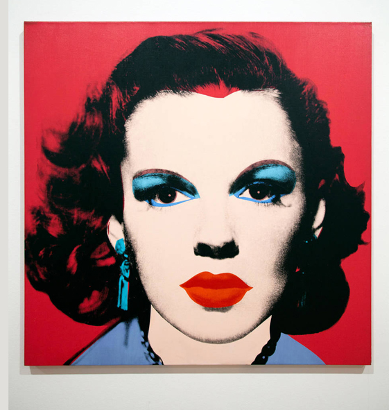 ‘Judy Garland’ by Andy Warhol at Museu Berardo Interior Rooms in Lisbon - Portugal, © Alamy
4. The Artist Was A Canny Businessman
From 1964 Warhol called his studio The Factory and claimed: ‘I want to be a machine.’ Sidestepping the idea of ‘handcraft’, he let his assistants do much of the work and multiple versions were produced of the images. For Warhol: ‘Being good in business is the most fascinating kind of art. Making money is art and working is art and good business is the best art.’ He used pre-existing brands and celebrity images as the backbone of his work – they had, after all, already proved successful with consumers.
Warhol was also reacting against Abstract Expressionists like Jackson Pollock (1912–56), who saw the action of applying paint to a canvas as essential to the process of making art. It could be said that Warhol’s use of ‘ready-made’ advertising images as raw material for his work would be seen as reconnecting with the objet trouvé experiments of the interwar Dada Movement. Publicity stills of figures such as Elvis or Marilyn Monroe were cropped, enlarged and recoloured to create modern icons. Warhol was not interested in these sitters as living, breathing figures – Monroe was already dead when he turned his attention to her. Instead he remade their portraits as potent symbols of desire and loss, drawn from the technicolour world of movies and music.
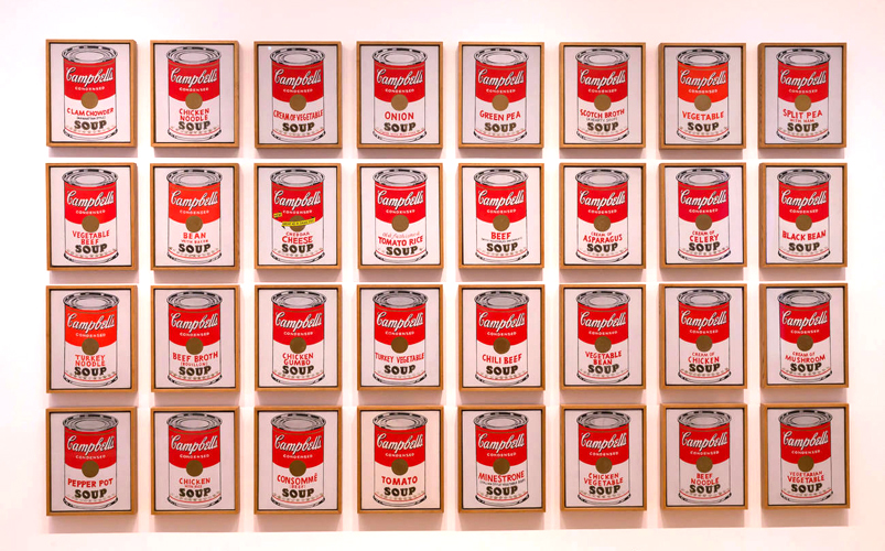 Campbell’s Soup Cans, Andy Warhol, 1962, © Alamy
5. Warhol appealed to our appetites
Warhol began playing with themes of instant gratification in his ice-cream dress fabrics. But his most famous experiment came in 1962, with the Campbell’s Soup Cans works. (He had a tin of the soup every day for lunch.) He exhibited the 32 canvases on shelves, like groceries in a shop. Baroque artists once painted butchers’ counters or kitchen tables laden with fruit. Warhol created an updated vision of the cornucopia; the sensory delights of lobster, tomato or beef, readily available in a can.
Warhol’s immediacy, his direct appeal to our appetites and his focus on bold colour and typography were transformative. In May 1964, the product marketing manager of Campbell Soup Company wrote to him: ‘Your work has evoked a great deal of interest here… At one time I had hoped to be able to acquire one of your Campbell Soup label paintings – but I’m afraid you have gotten much too expensive for me.’ Using the technology of poster production, Warhol had blurred the boundaries between ‘high’ and ‘Pop’ art with huge success. And as he became more successful, so Warhol himself had become the brand.
SUZANNE'S TOP TIP
You can still pick up affordable Warhol designs. Look out for his album covers in charity shops and online auctions. Some date from the 1950s, when Warhol designed record sleeves for RCA Victor, creating artwork for LPs by Horowitz, Toscanini and Count Basie. In 1967 he famously drew a banana with a peel-off skin for the provocative The Velvet Underground & Nico album. (The original versions, with these stickers, are now rare.) Warhol also worked with the Rolling Stones, making the Sticky Fingers (1971) cover, a collage of a zip and tight jeans. These designs are the very essence of Pop – witty, gimmicky and sexy.
You can access the online resources from The Andy Warhol Museum, which holds a collection of more than 900 paintings, 2,000 works on paper and 200 Screen Tests. See warhol.org
OUR EXPERT'S STORY
Dr Suzanne Fagence Cooper is a writer, curator and lecturer, specialising in 19th- and 20th- century art and design. She was a research fellow at the V&A Museum, and then a research curator at York Art Gallery. Her latest book, To See Clearly: Why Ruskin Matters is published by Quercus. Her lectures include Pop Goes the Artist: from Warhol to Dylan and Ravilious, John Piper and English Romantic Modernism. She lives in Yorkshire.
Stay in touch with The Arts Society! Head over to The Arts Society Connected to join discussions, read blog posts and watch The Arts Society at Home - a series of films by Arts Society Accredited Lecturers, published every fortnight.
About the Author
Dr Suzanne Fagence Cooper
Article Tags
JOIN OUR MAILING LIST
Become an instant expert!
Find out more about the arts by becoming a Supporter of The Arts Society.
For just £20 a year you will receive invitations to exclusive member events and courses, special offers and concessions, our regular newsletter and our beautiful arts magazine, full of news, views, events and artist profiles.
FIND YOUR NEAREST SOCIETY
MORE FEATURES
Ever wanted to write a crime novel? As Britain’s annual crime writing festival opens, we uncover some top leads
It’s just 10 days until the Summer Olympic Games open in Paris. To mark the moment, Simon Inglis reveals how art and design play a key part in this, the world’s most spectacular multi-sport competition


