This wonderful Cornish workshop and museum is dedicated to the legacy of studio pottery trailblazer Bernard Leach
Celebrating the wonders of the Memphis Group with five objects
Celebrating the wonders of the Memphis Group with five objects
4 May 2021
Billie Muraben considers the legacy of the controversial design group ahead of a new exhibition at MK Gallery
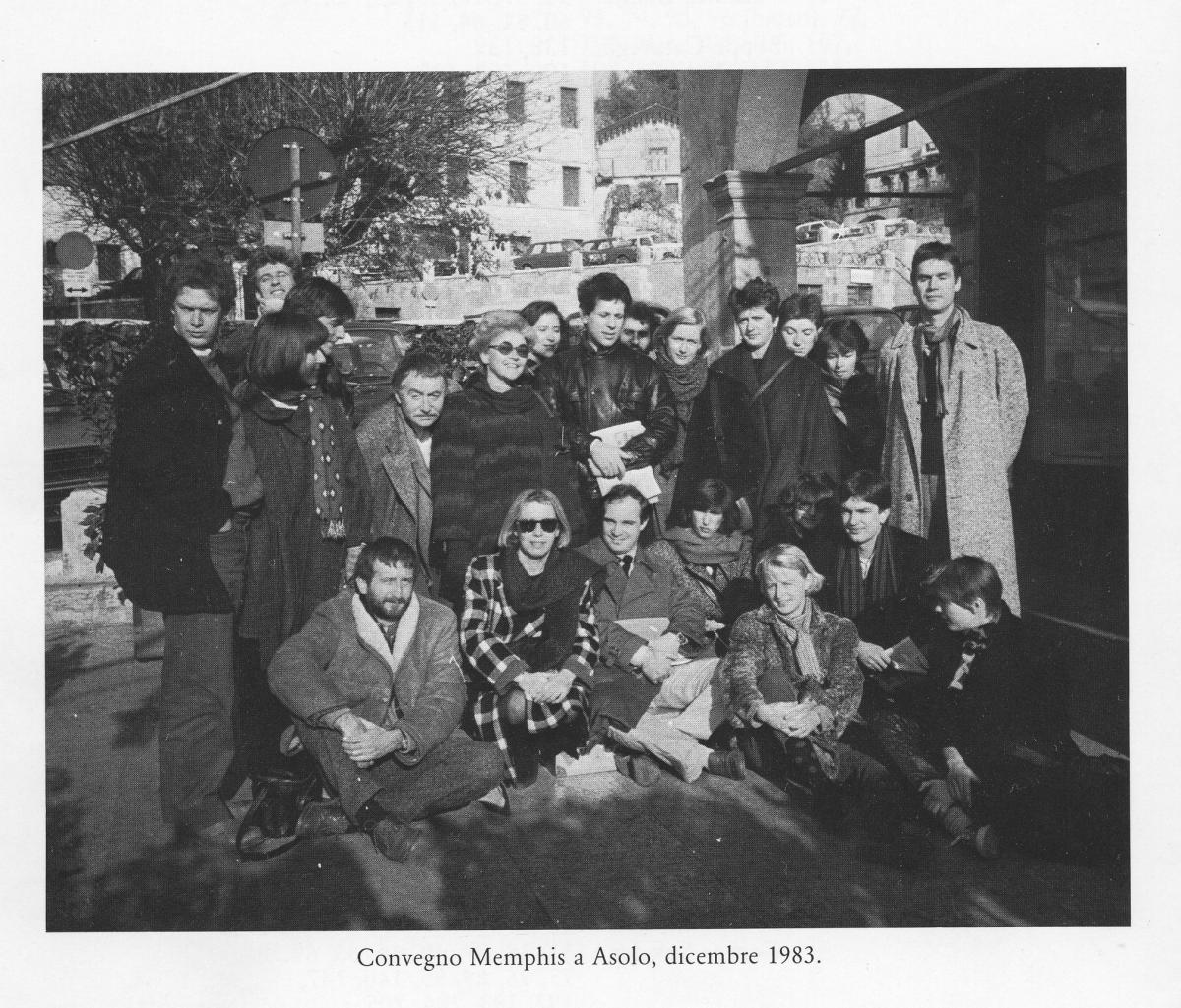 Memphis meeting at Asolo, Italy, December 1983. From the book “Memphis, Research, Experience, Results, Failures and Successes of the New Design” by Barbara Radice, ed Electa. Courtesy Memphis Srl
Memphis took its lightness seriously. It was founded in 1980 by Ettore Sottsass who, after inviting a group of designers and friends to his home to discuss the potential of ‘very updated’ furniture, asked the owners of a showroom in the centre of Milan to display the work, and launched the novel, sculptural furniture into the world.
Predominantly made up of Italian designers, including Sottsass, Michele De Lucchi and Alessandro Mendini, the group invited international designers – such as Nathalie Du Pasquier, Shiro Kuramata, Michael Graves and Peter Shire – to broaden perspectives and help legitimise their vision. The Memphis Group never wrote a manifesto, and it wasn’t built to last: ‘Powerful ideas, they are what they are,’ said Sottsass. ‘They descend like lightning bolts. They’re here one minute and then they’re gone the next.’
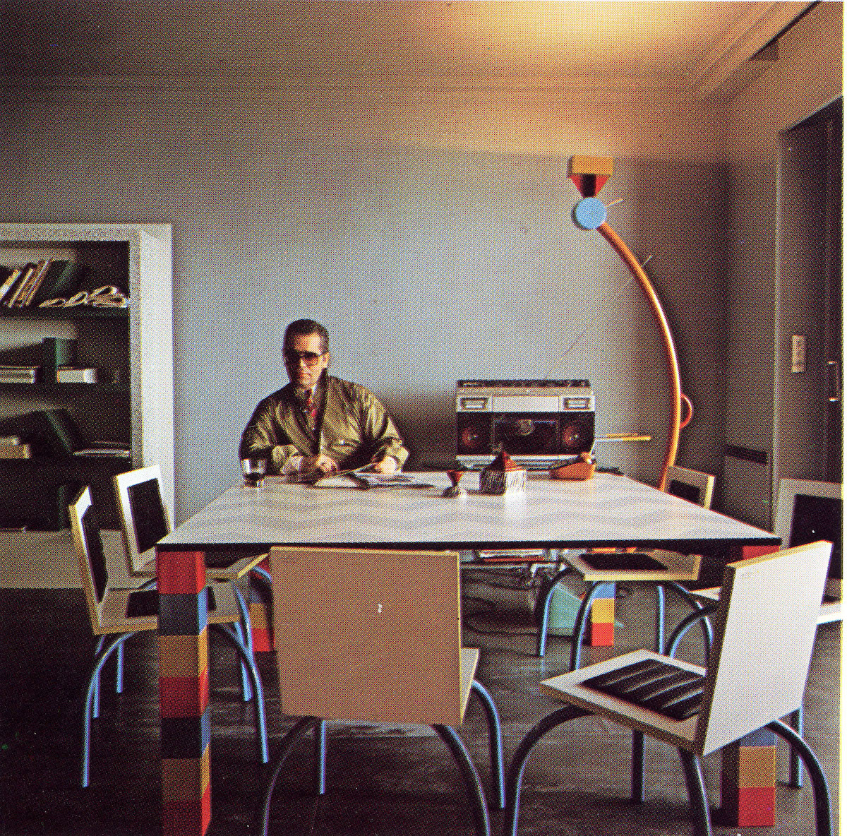 Karl Lagerfeld in his Monte Carlo apartment. “Pierre” table by Sowden, “Riviera” chair by De Lucchi, “Treetops” lamp and “Suvretta bookcase by Sottsass. Ceramics by Matteo Thun. Memphis 1981. From the book Memphis, Research, Experience, Results, Failures and Successes of the New Design by Barbara Radice, ed Electa. Photo: Jaques Schumacher. Copyright Mode & Wohnen
Although the group had disbanded by 1987, its legacy still holds and has been through various cycles of expression: in popular culture, advertising, architecture, interiors, contemporary art and design. At the time, Memphis was accessible only to the rich (David Bowie was a collector, and Karl Lagerfeld furnished his Monte Carlo apartment with Memphis pieces) and has been rightly criticised for failing to see the irony in seeking cheap, man-made materials, while deriding mass production. It has been described as ‘a shotgun wedding between Bauhaus and Fisher-Price’ and celebrated as an antidote to self-serious functional rationalism. But it wasn’t as simple as just being fun – the Memphis Group was rigorous in its reaction against Modernism; frivolity was a serious pursuit.
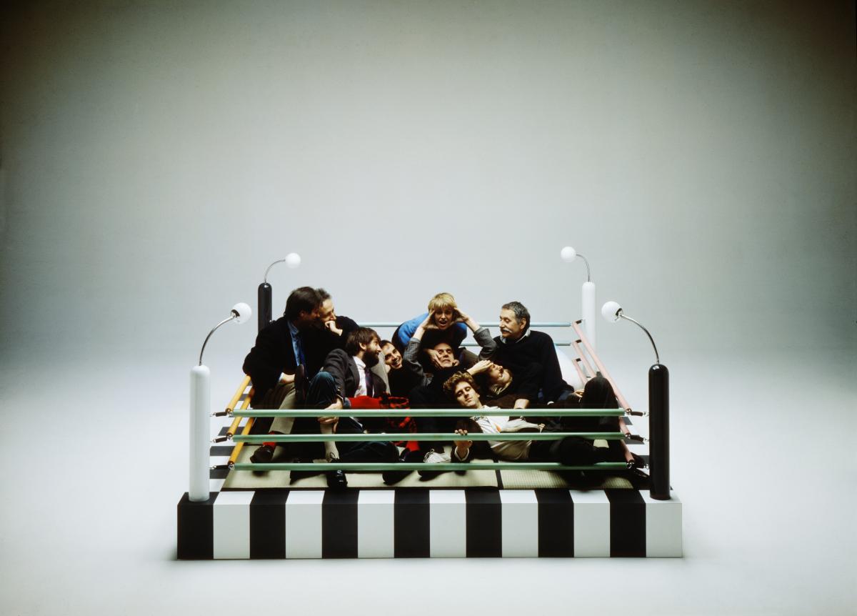 Memphis designers with Masanori Umeda's Tawaraya Bed 1981. Courtesy Memphis Post Design Gallery. Photo © Studio Azzurro
Tawaraya by Umeda Masanori
One of three Japanese designers in the Memphis Group, Umeda Masanori had moved to Italy to work with Achille and Pier Giacomo Castiglioni, before becoming a design consultant for Olivetti. On being invited to participate in the Memphis Group, he designed Tawaraya, a sort of conversation pit, sat within the ropes of a boxing ring. It became an iconic symbol of the group after its members posed in the ring for a publicity shot at their first exhibition.
Combining a monochrome base with pastel-coloured ropes, chrome-plated metal, lacquered wood lighting and tatami mats at its centre, the Tawaraya seems cartoonish and ridiculous, but on closer inspection it offers a functional setting and multiple potentials. Alongside his drawings for the piece, Umeda described four uses: ‘1. As a shrine for reflecting nulla (anything), cielo (heaven, sky), tristezza (sadness), vita (life). 2. As a platform to celebrate gioia (joy), cerimonia (ceremony), festa (holiday), stagione (season). 3. As a conversation area with activities of banchetto (banquet), dialogo (dialogue), godimento (enjoyment), sapienza (wisdom). 4. As a bed for notte (night), amore (love), sogno (dream), cuore (heart/life).’
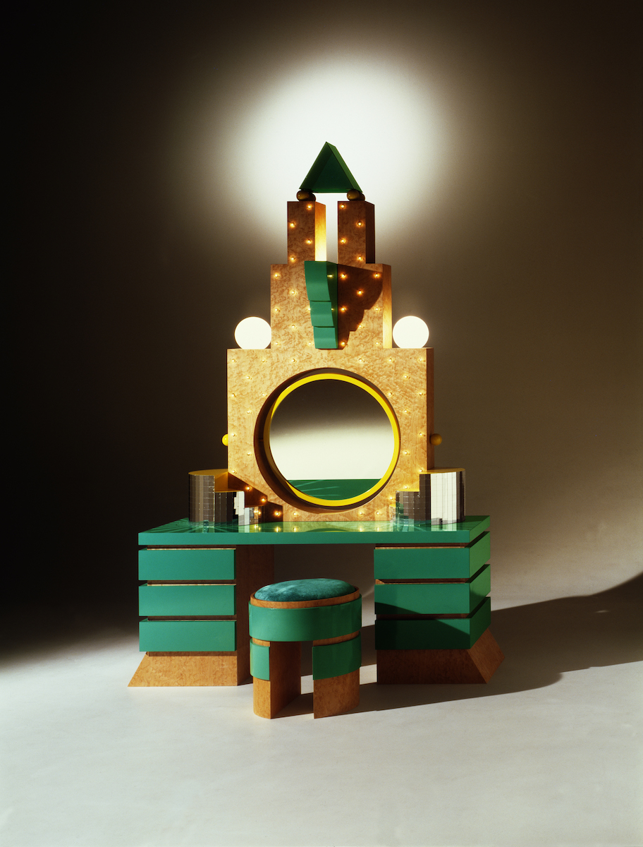 Memphis Milano Collection. Photo: Aldo Ballo, Guido Cegani, Peter Ogilvie. Courtesy Memphis Srl
Plaza by Michael Graves
Mimicking the stepped profile of a skyscraper, Plaza – a dressing table in wood and briar veneer, with a central mirror, trimmed by a frame of bulbs and a stack of disco-ball tiles at its base – was designed by Michael Graves in 1981. Influenced by the aesthetic of Art Deco and storied Hollywood glamour, its architectural grandeur criss-crosses with its inexpensive materials in a way that is characteristic of the Memphis Group. While the elaborate structure is plush and decorative, it isn’t without function: the light bulbs, positioning of the mirror and height of the velvet-topped seat support its purpose as a vanity, bathing its occupant in flattering light.
Although Plaza draws from a broad pool of references, it was named after New York’s Plaza Hotel, a faux-French Renaissance ‘château’ designed by Henry Janeway Hardenbergh in 1905. Graves’ version is just as campy.
Graves only briefly participated in Memphis, having previously been one of the New York Five, a group of architects colloquially known as ‘the Whites’, because of their obsession with pure form in Modernism. However, he remained committed to his departure from the white box, in favour of the ‘decorated shed’. He went on to design skyscrapers, municipal buildings and the Dolphin and Swan hotels at Disney World, Florida.
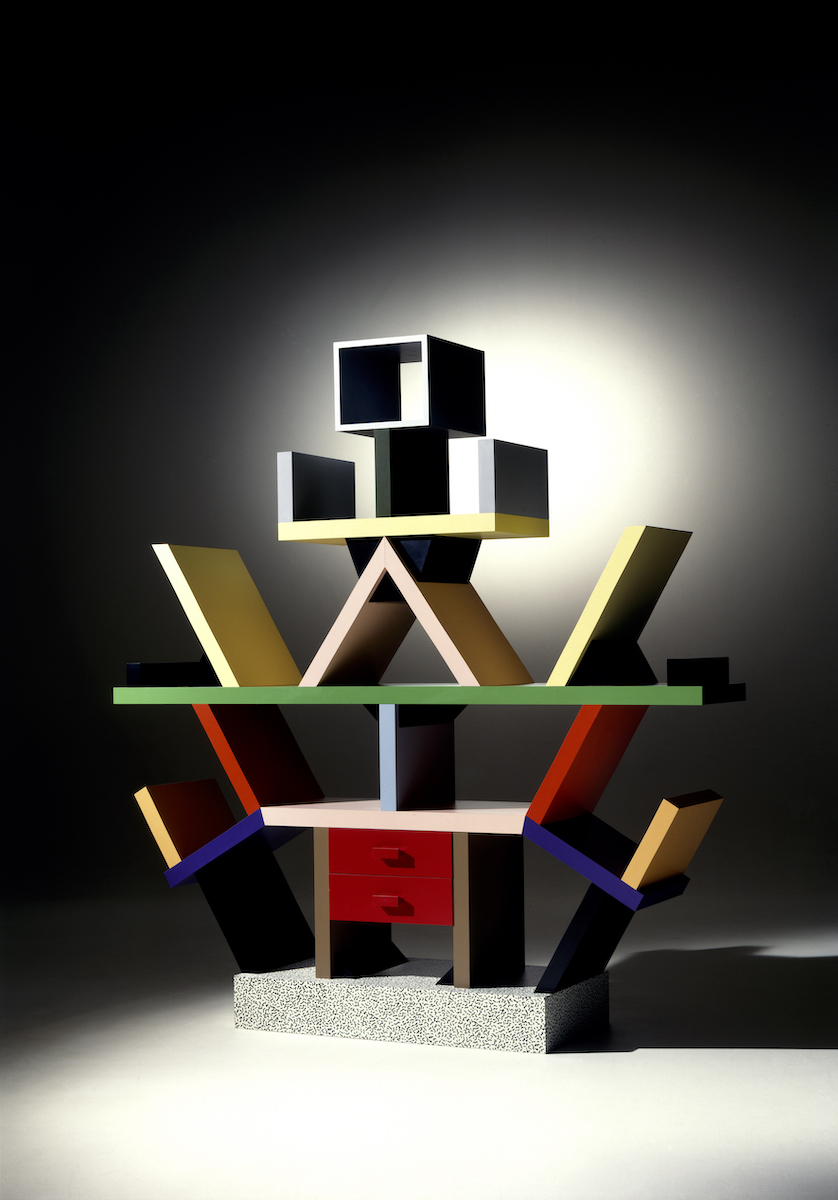 Photo: Pariano Angelantonio. Courtesy Memphis Srl
Carlton by Ettore Sottsass
The Carlton, named after the London hotel, is a bookcase, a chest of drawers, a room divider, a sculpture, a totem. It serves several practical purposes yet could also be entirely decorative. By calling into question various conventions of furniture design, it became emblematic of the qualities of Memphis design. Visually, Carlton reads in various ways. It could be robotic, mystical, or even human, and while it seems counterintuitive as a structure, beneath the surface is a logical system. The various triangles that make up the form create supportive, enclosed spaces; slanted shelving acts as bookends; and, as a room divider, it defines a space, without compromising on light.
‘When I was young, all we ever heard about was functionalism, functionalism, functionalism… It’s not enough. Design should also be sensual and exciting.’
Handcrafted from MDF and plastic laminate, it’s a high-end piece made from low-end materials; a common thread across the Memphis Group, and a quality that’s been both celebrated and derided. But the approach of pushing the limits of functionalism, minimalism and the perception that there was only ‘one way of doing things’ is to be celebrated. As Sottsass said: ‘When I was young, all we ever heard about was functionalism, functionalism, functionalism… [Functionalism] It’s not enough. Design should also be sensual and exciting.’
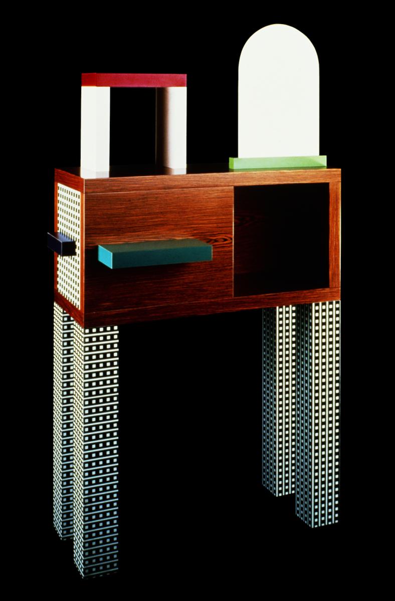 Photo: Roberto Gennari. Courtesy Memphis Srl
Emerald by Nathalie Du Pasquier
This wooden sideboard, supported by long, plastic-laminate pillars, topped with a plastic arch and domed mirror, combines Nathalie Du Pasquier’s interest in patterns and volume. Whether communicated through pieces of furniture, or drawn or painted patterns, her decorated surfaces give structure and dimensionality to her objects, rather than the structure having decoration applied as an afterthought.
Leading with the image – the decorated surface – was integral to Memphis. In an interview with Metropolis, Pasquier reflected on the moment that inspired their approach: ‘There was a strong need for telling stories. There was also more money all of a sudden, and consumerism became fashionable again! It was the Postmodern moment!’
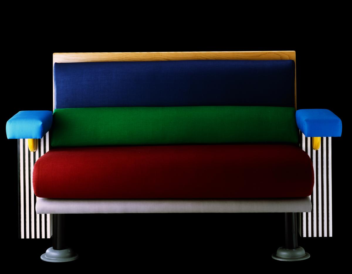 Photo: Studio Azzurro. Courtesy Memphis Srl.
Lido by Michele De Lucchi
A padded bench, with a firm, short seat, upholstered in rich, jewel tones and held within a striped-edge frame, the Lido seat was designed by Michele De Lucchi in 1982. The mix of materials – wool, lacquered wood, metal and plastic laminate – combines traditional approaches to domestic furniture with materials more readily associated with fast-food restaurants. The use of colour, which is entirely decorative, would also have been progressive at the time, when Modernist practices had encouraged colour only in relation to practical requirements.
The folds of its wool padding give the seat the appearance of the edge of a layered sponge cake or a Viennetta dessert, and while the colours and attention to detail – gold supports connecting the emerald green armrests with the monochrome, striped base – are mesmerising, the seat was purposefully designed to be uninviting. The Lido is meant to be uncomfortable, designed as a place to pause rather than lounge (as opposed to the legacy of its namesake). It is one of many juxtapositions that characterise Memphis, where conventions of material, use and experience were often turned on their head. The story goes that the name ‘Memphis’ first appeared in one of De Lucchi’s notebooks, at the top of a page dated a few days before their initial meeting at Sottsass’s home, where Bob Dylan’s Stuck Inside of Mobile with the Memphis Blues Again was caught on repeat.
SEE
Memphis: Plastic Field at MK Gallery, Milton Keynes
Reopens 18 May – 12 September
Billie Muraben is a freelance writer and curator
About the Author
Billie Muraben
JOIN OUR MAILING LIST
Become an instant expert!
Find out more about the arts by becoming a Supporter of The Arts Society.
For just £20 a year you will receive invitations to exclusive member events and courses, special offers and concessions, our regular newsletter and our beautiful arts magazine, full of news, views, events and artist profiles.
FIND YOUR NEAREST SOCIETY
MORE FEATURES
Ever wanted to write a crime novel? As Britain’s annual crime writing festival opens, we uncover some top leads
It’s just 10 days until the Summer Olympic Games open in Paris. To mark the moment, Simon Inglis reveals how art and design play a key part in this, the world’s most spectacular multi-sport competition


